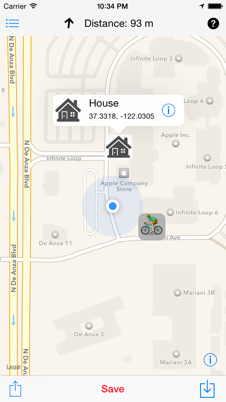
About
Device.css is a project that helps you to display app screenshots including phones, tablets and screens easily with pure CSS file sized 29Kb only. They are scalable and use CSS3 styles to enable you to use vector graphics that looks sharp on any resolution.
Example
<link rel="stylesheet" href="device.css" type="text/css">

<div class="iphone-6 silver"></div>
Results

Check out more extensive demo here.
Usage
- Include
device.cssor generate your custom subset of devices.<link rel="stylesheet" type="text/css" href="css/device.css"> - Add model name from the list to your div’s classes
<div class="iphone-6 silver"></div> - You can scale the phone using font-size style, with font-size of 12px being 100% screen size, 6px - 50% etc.
<div class="iphone-6 silver" style="font-size:6px"></div>
Supported devices list with options:
- iPhone 6
- base CSS class: iphone-6
- required color scheme CSS class space-gray or silver
- optional CSS class landscape for horizontal orientation
Example:<div class="iphone-6 space-gray landscape"></div>
- iPad Mini 3
- base CSS class: ipad-mini-3
- required color scheme CSS class space-gray, silver or gold
- Macbook Air
- base CSS class: macbook-air
- iMac
- base CSS class: imac
Requirements
Safari 6.1+, Chrome 26.0+, Opera 15.0, FireFox 16.0+, IE 10+
iOS Safari 7.1+
Android Browser 4.4+, Chrome for Android 42+
Sources
Sources available in repository famer/device.css.
Issues
If you find some bugs or issues feel free to submit report in issues section.
License
Device.css and its sources are released under MIT license.
Share
Copyright
Devices are created with CSS magic by Alex Inkin, project managed by Timur Tatarshaov. You are free to use it anywhere according to MIT license. © 2015
